OVERVIEW
The Givepact Requirements
This project aimed at providing feedback about fixing small errors in the user-flows, ultimately to get better conversion traffic on their side.
PROJECT TYPE
This was a client project!
A usability testing project for Givepact under the supervision of Ms. Iris Bierlein
MY ROLE
What'd I do?
A UX Design Consultant - primarily performing the duties of a usabililty testor!
This was a team of 4 people and we all worked on recruiting participants, conducting usability tests, working on the insights, pulling out recommendations and designing before and after high-fid prototypes, and pitching these deliverables to the client.
BUSINESS OBJECTIVE
What did Givepact expect out of this?
This project aimed at providing feedback about fixing small errors in the user-flows, ultimately to get better conversion traffic on their side.
TIMELINE
How long did we work on this for?
4 weeks ~
DEVICES ANALYSED ON
Which version was Givepact on?
It was a Webapp version
Givepact Problems
Google analytics showed high drop-off rates
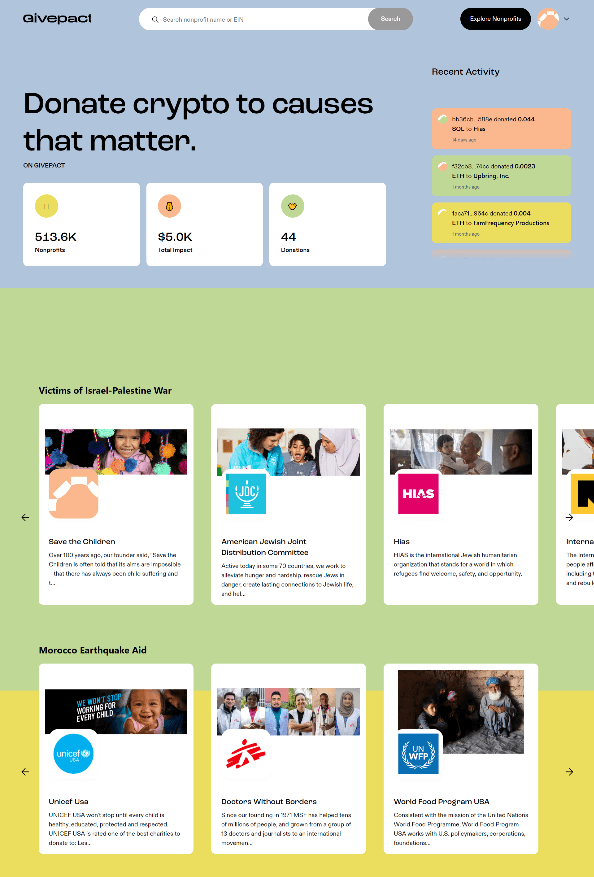
Minimal usage of the platform was another problem - these lead to low conversion rates
Givepact Expectations
Increasing cryptocurrency contributions
Making sure people follow through till the end of the donation process
We had many constraints too
The client only expected low-effort recommendations
We had a limited span of 4 weeks for delivery
Design issues
What design problems did we observe?
The final donation steps looked incredibly confusing wrt the amount (in crypto), which made our participants drop off halfway too
Solution
We proposed the following recommendations
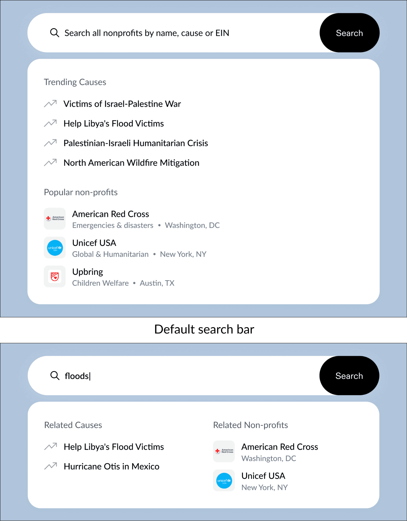
Optimizing the search to find NPOs based on a cause.
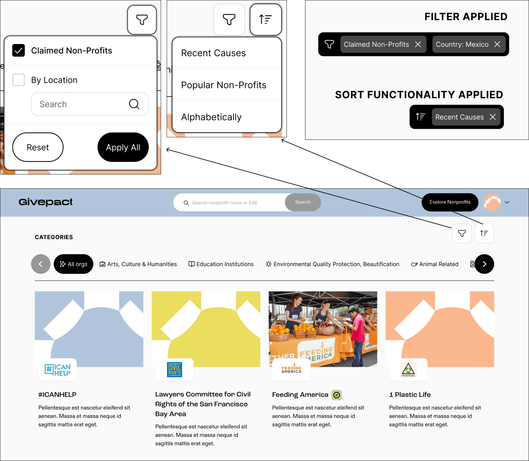
Adding "FILTER" & "SORT" features to enhance the experience of finding NPOs.
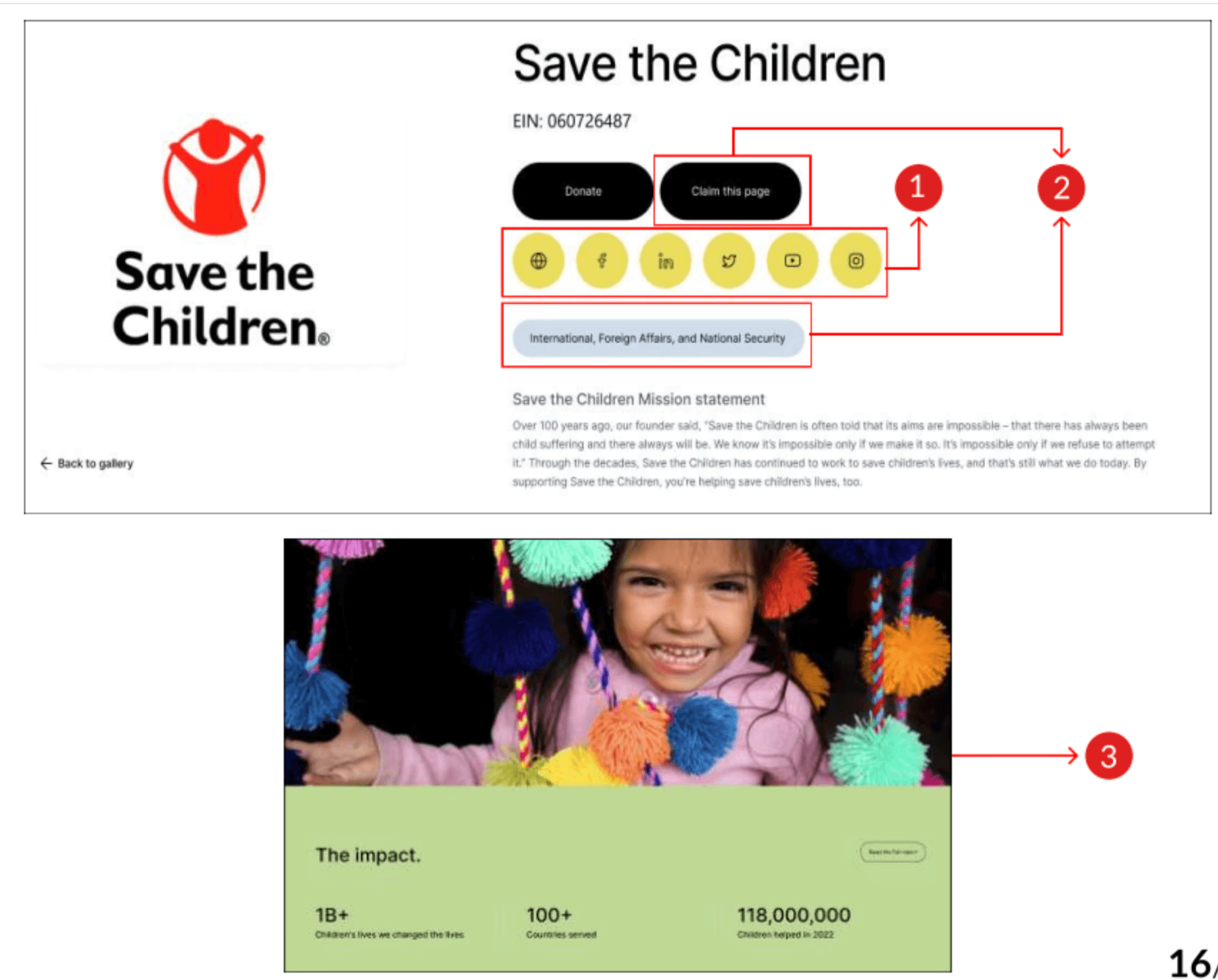
Increasing NPO transparency by highlighting their impact and online presence.
Giving the provision to make payments through multiple methods.
Our approach
How'd we go about this project?
We conducted an in-depth analysis of user behavior and pain points to influence our strategic solution proposals which inturn would enhance conversion rates.
Our approach involved leveraging Google Analytics data and recruiting 11 users for think-aloud moderated usability tests.
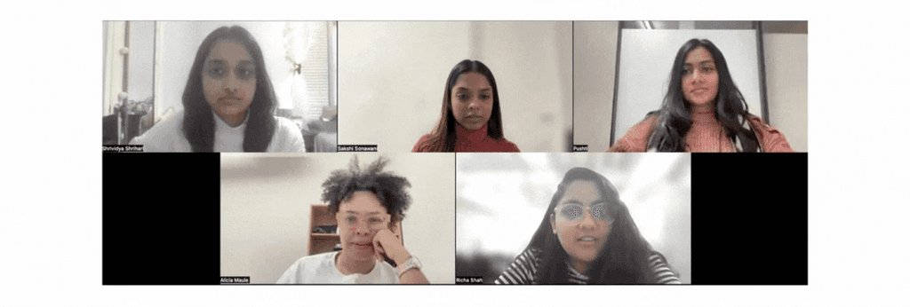
Meet Our Team
It all started with a kickoff meeting
During the meeting with Alicia Maule (founder of Givepact), we defined the scope of this project, deliverables, and obtained quantitative data (google analytics for the website).
Our approach
Problem Statement
After the initial lay of the ground, this is the problem statement catering to both the users and Givepact
How might we remove the inconvinience caused to the users while they are finding desired NPO's information - leading them to drop off without donating?
What
Who
Why
Participants recruiting
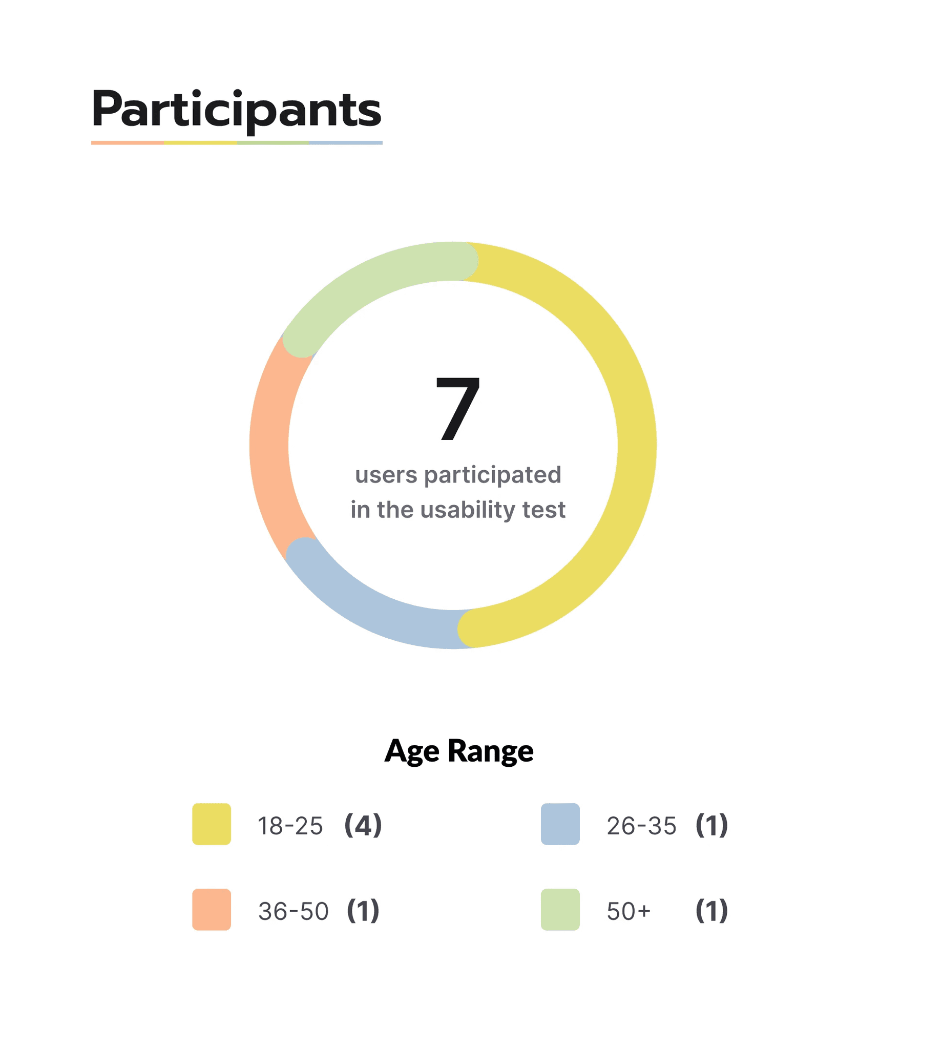
A total of 10 participants were recruited
Between the ages 18-50+ - based on a persona to make sure that -
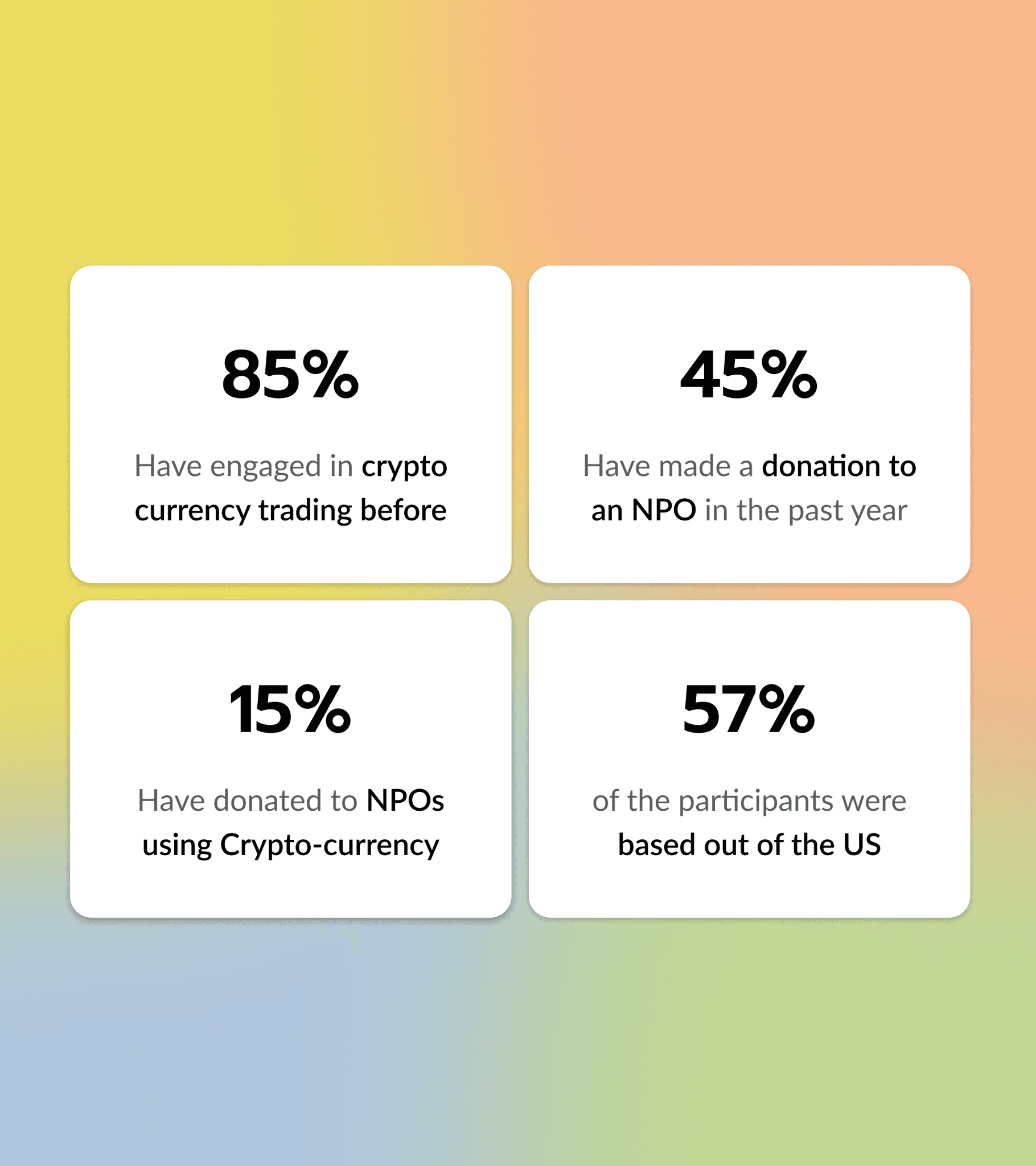
They have some level of awareness in crypto to help navigate the site
They should have prior experience or knowledge of donating to any NPO to make sure they know what they should look for while donating.
User Testing
Moderated user testing sessions were conducted
These sessions were conducted over Zoom and all the participants were encouraged to think out loud during the process to analyze both action and thoughts (both positive and negative)
User testing
Specific situational user-flows were provided to all participants
SITUATION - As a crypto philanthropist, familiar with Givepact, you have come across the news of the devastating floods in Libya. Motivated to aid the disaster victims, you want to leverage Givepact to make a crypto donation.
Givepact Problems
Choose an NPO that's supporting disaster victims
Goal - Is the search feature really helping the users find what they need?
Givepact Expectation - 1
Determine if the NPO aligns with your values
Goal - Are the external description links usable? Available?
Givepact Expectation -2
Make a donation to the NPO in Bitcoin
Goal - Are all the necessary steps for a user to take a decision without inconvinience?
Affinity mapping
We combined all the data to gain valuable discoveries
Key Findings
What did we find out?
From our respective sessions, all data was combined to gain valuable discoveries which later became a basis for our recommendations
6/10
Felt the process of locating the desired NPO could be more efficient.
5/10
Felt the process of identifying the desired NPO sections - could be more efficient.
7/10
Loved donation by crypto and it's benefits, and wanted to donate - were unsure about how trustworthy it was!
User Thoughts
Snippets of what users thought out Aloud!
From our respective sessions, all data was combined to gain valuable discoveries which later became a basis for our recommendations

"When a filter is applied, on what basis is the first NPO shown? Is it sorted alphabetically, or based on rating or donations made?"

"Really liked how the impact was shown in numbers. But did not realize that all data was generic & not about the non-profit. It wasn’t specific to the cause."

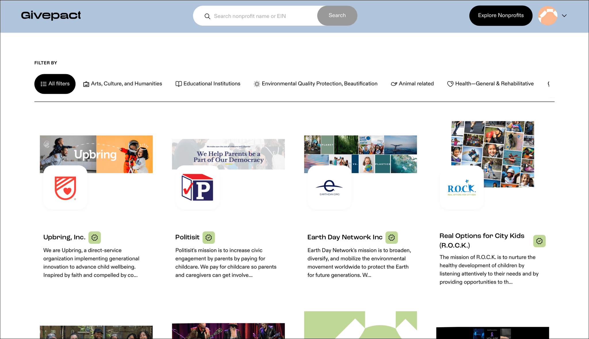
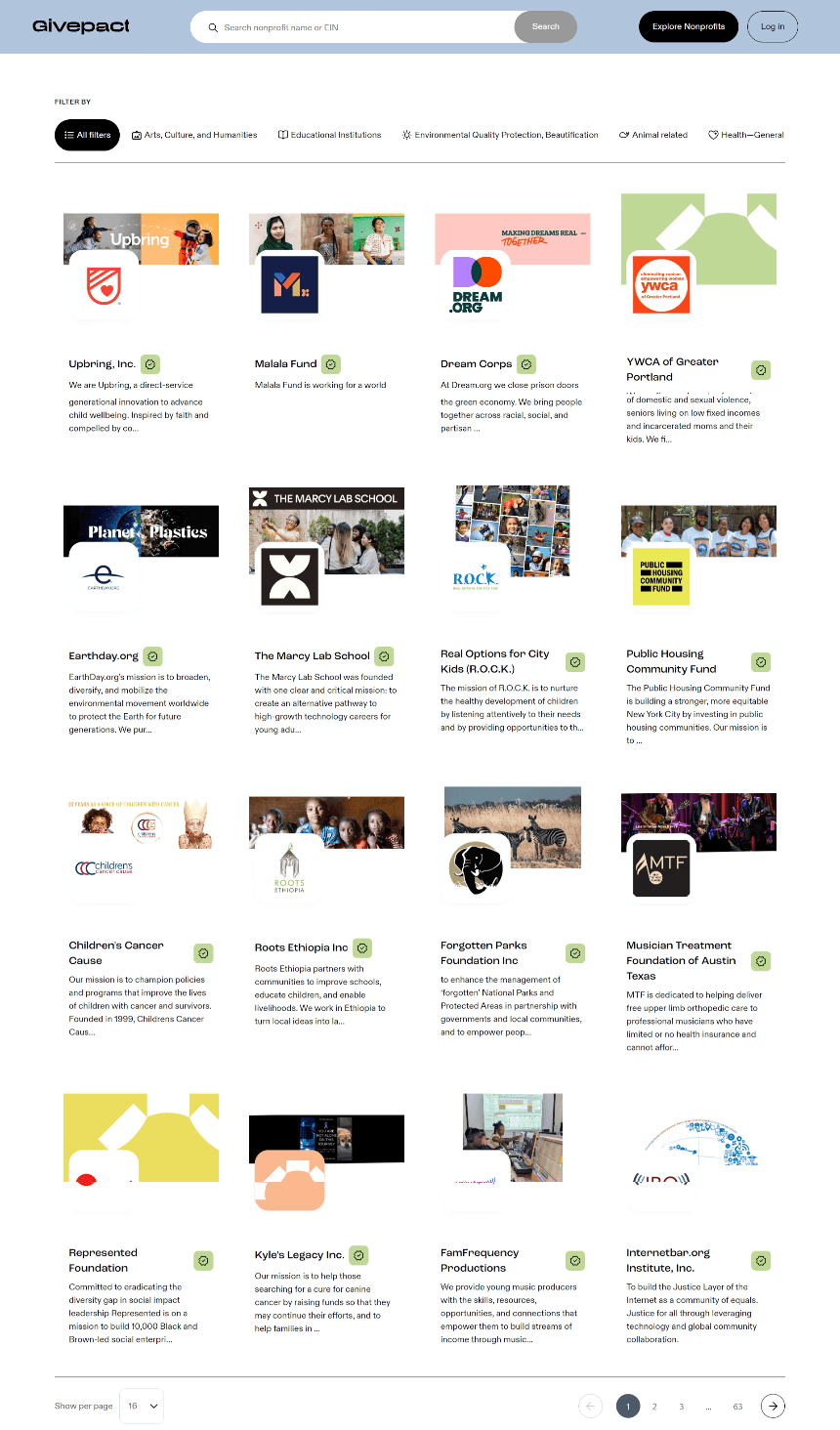
"I did not realize that these filters are horizontally scrollable! "
Recommendation 1
Optimizing the search bar to find NPOs based on a cause
A user's thoughts…
The search bar isn't giving me the NPOs I search for, what's the use? :(
The Issue
8/10 participants faced the same issue
The Before
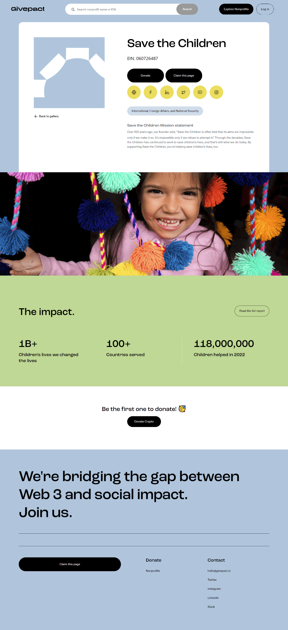
Current Status - Users should find an NPO based on it’s name and EIN number.
However, during the study, all the participants input the name of the social cause they were looking for since they did not have a specific NPO in mind.
The After
Displaying ‘Trending causes’ and ‘Popular non-profits’ in search bar. Providing contextual suggestions like ‘Related causes’ and ‘Related non-profits’ while typing in the search bar.
Before
After
Recommendation 2
Increasing NPO transparency by highlighting their impact & online presence
A user's thoughts…
"Did not notice the different platform links associated with the non-profit. Also having external links to articles about the NPO would be helpful."
The Issue
9/10 users did not interact with the external social media links
The Before
Current Status - Not enough visibility of how much impact has been made. Lack of familiarity with social platform logos because original logos were not used.
The After
Using original logo for social media icons. Including additional media and web articles to increase credibility.
Before
After
Recommendation 3
Adding 'Filter' & 'Sort' features to enhance the experience of locating NPOs
A user's thoughts…
"When a filter is applied, on what basis is the first NPO shown? Is it sorted alphabetically, or based on rating or donations made?"
The Issue
8/10 could not figure out the scrollable filters and hence had to resort to the search bar
The Before
Current Status - Lacks sufficient guidance on how donors can effectively filter NPOs. Absence of sort feature and visual affordance for horizontal scroll
The After
Incorporating 'Filter' & 'Sort' features to uphold user control and freedom. Enhancing visual affordance to emphasize horizontal scroll.
Before
After
Recommendation 4
Giving the provision to make payments through multiple methods
A user's thoughts…
"It would have been more convenient if I could connect my crypto wallet even at this stage in the process just like we could in the beginning."
The Issue
7/10 Expressed the wish to connect their crypto wallet at end of the process.
The Before
Current Status - Users were only provided with the provision to connect their wallet in the beginning and then the link for payment in the end.
The After
Giving the user the ability to connect to their wallet after completing the donation form. Also providing them with a QR code in addition to the existing link to give the user their freedom to choose the payment method.
Before
After
Output
Foreseeing 30% in Conversion rates!
Many problems faced by the user due to which they drop off are solved, so they might stick around till the end and donate for good causes now :)
Verdict
The client was really happy!
They say they are looking to implement it real soon :)


